Bandcamp Rebrand
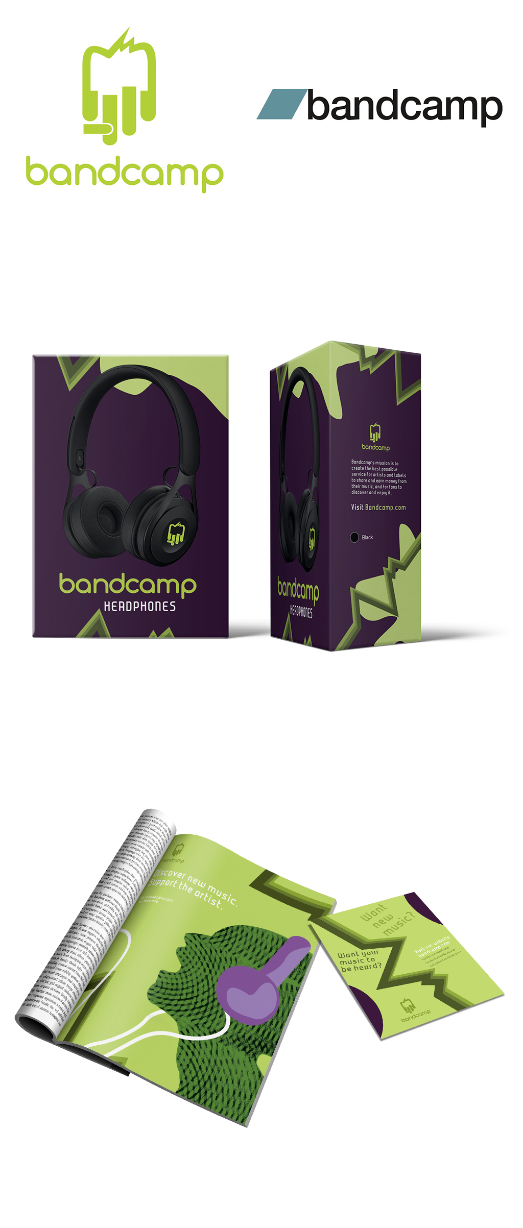
The logo, on the left side, is a rebrand of the online music streamer, Bandcamp. Bandcamp is used for new and upcoming musicians trying to promote their music, for promote new music labels and for fans of new artists. The idea was to take the original Bandcamp logo, shown on the right side, and rebrand it to make it look more interesting and relatable. The approach I went with this rebrand was the idea of different ideas related to music and putting it in one logo. You can see headphones, piano keys, sound waves, etc. Bandcamp is all about the music and showing that in the logo will help make it understandable.
To go with the Bandcamp Rebrand Logo, I decided to do a package. The package consists of a headphones box, a small flyer and a magazine ad. The packaging design is showing what sound could look like. The waves on the magazine ad and the green shapes on the headphone box indicate sound by the way they move across the design. The color choice is the energy from sound. The green and purple has that feeling of energy that someone would feel when listening to music.
